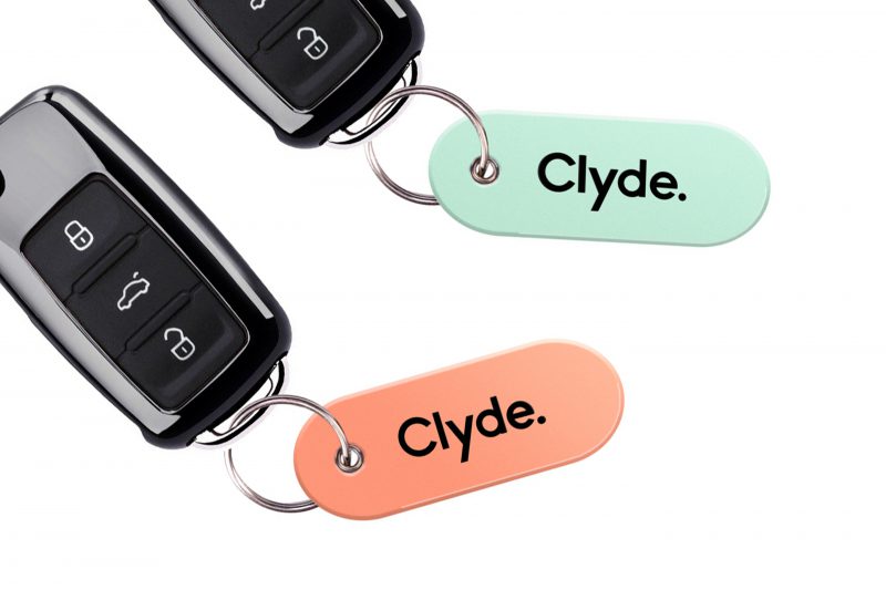
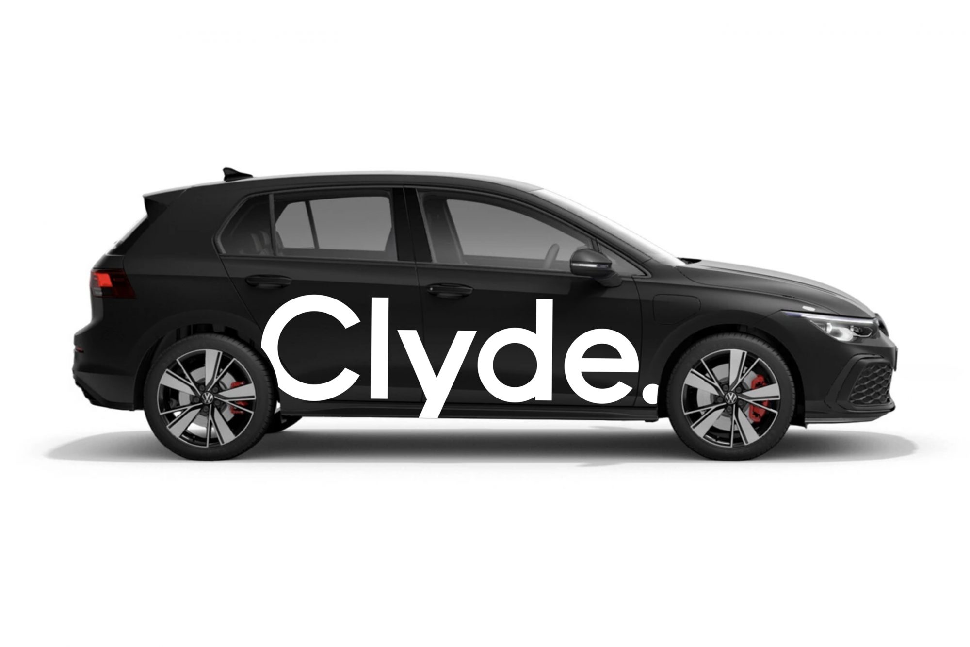
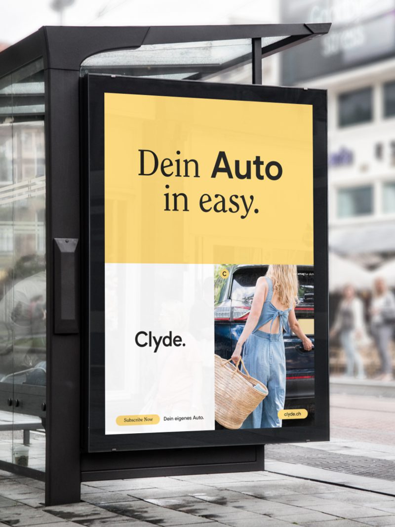
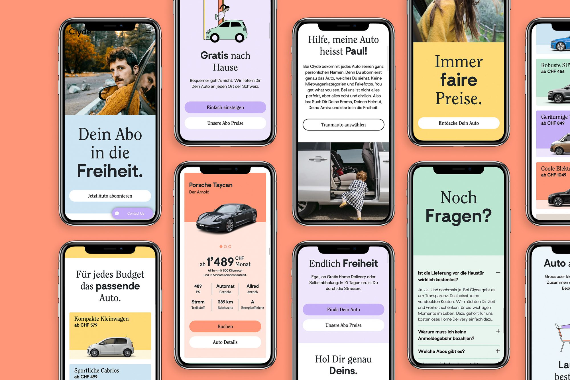
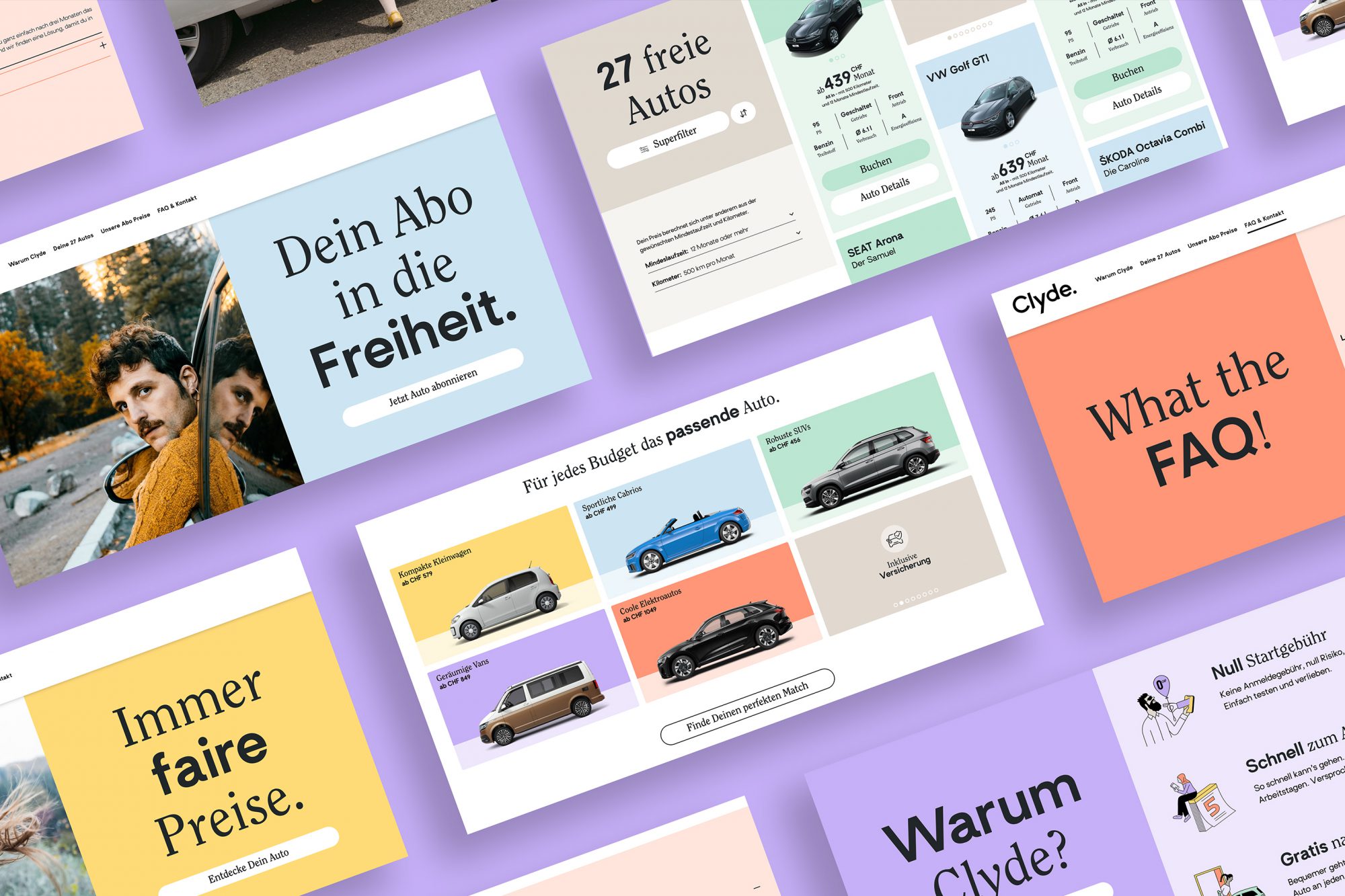
Clyde is a car subscription company based in Zürich and operating throughout Switzerland. The brand approached us to provide a complete brand redesign, with the aim being to create a more contemporary and unique look. After analyzing the market, competitors and understanding the user groups, Cee Cee Creative’s design department developed a design strategy, followed by a radically new corporate identity including a new logo, a new approach to colors and fonts, and a new contemporary image concept. A fresh tone of voice completed the design talks, creating a seamless new brand experience. All of which was aimed at positioning the brand as a compelling, reliable, and successful player on the market and offering a seamless and friendly brand experience to the customer. Three words were defined to embody the spirit of the new brand – easy, inspiring, flexible. These words then inspired the clean, minimal, and direct logo, with multi-colored palettes with a flexible grid.
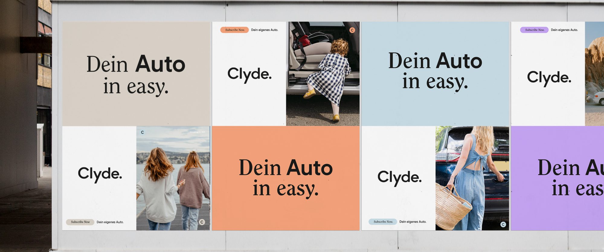
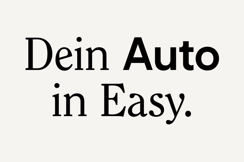
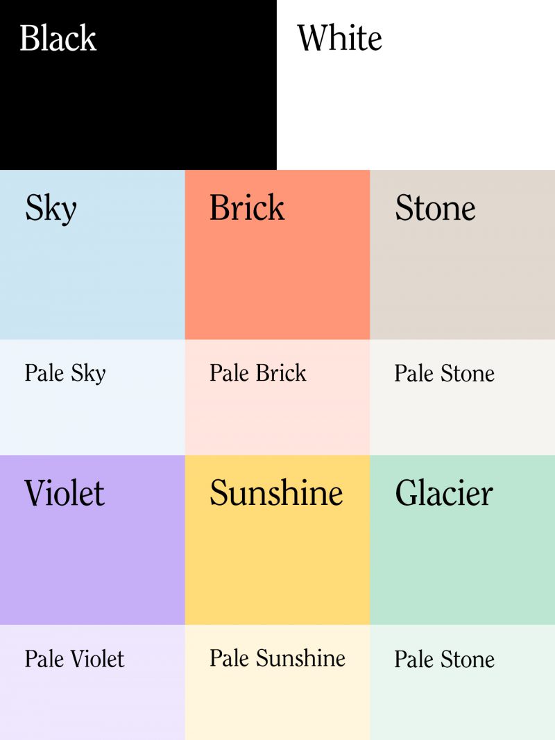
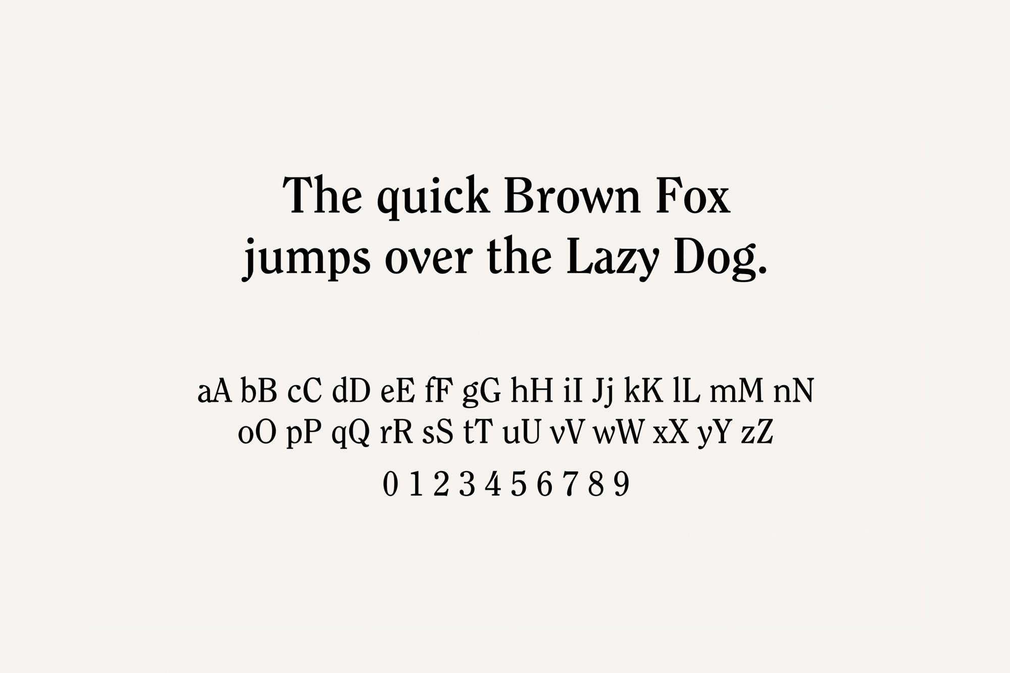
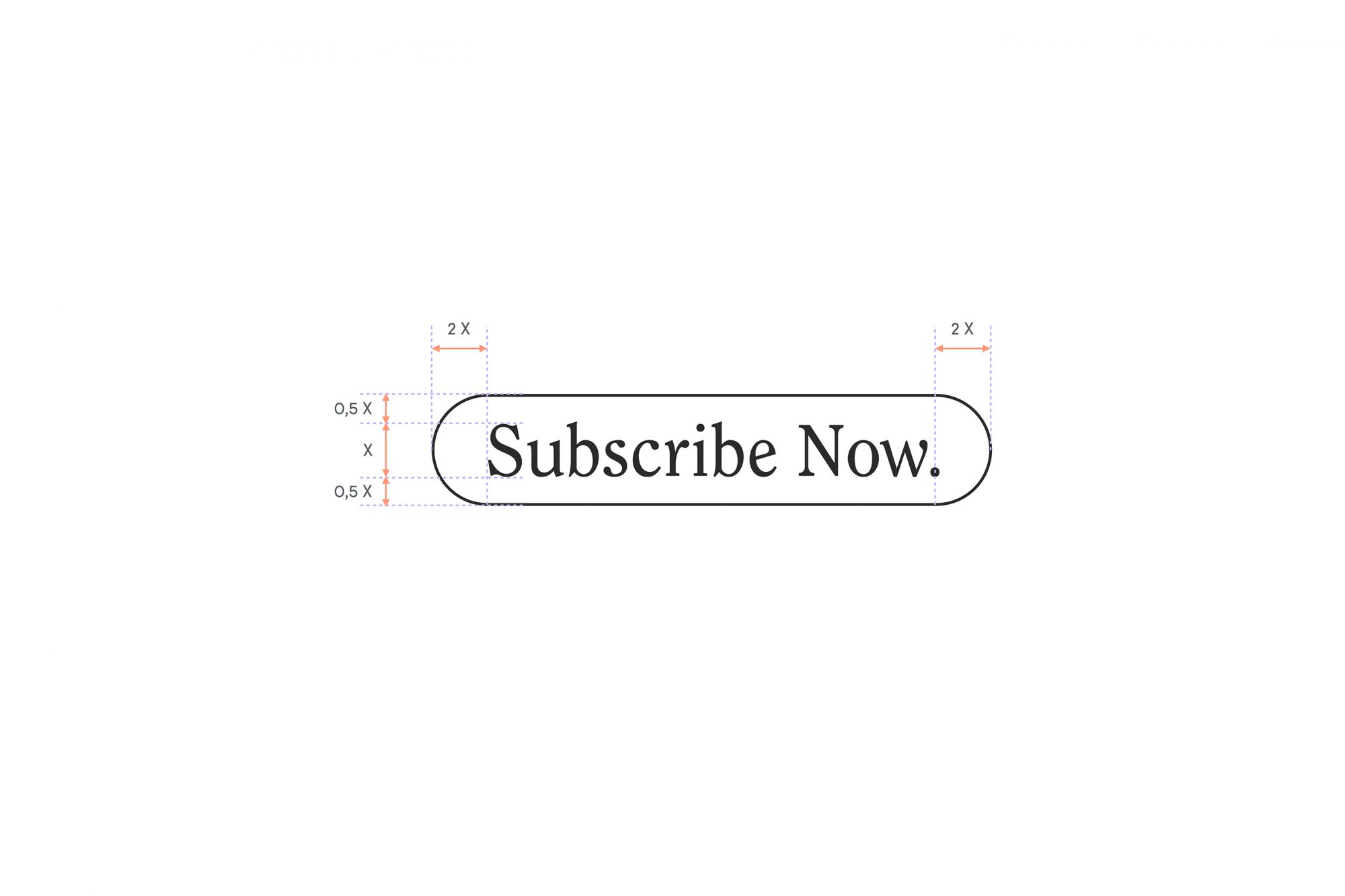
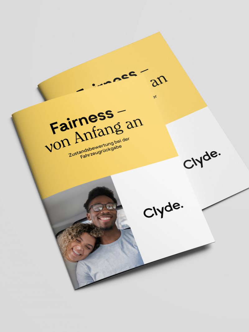
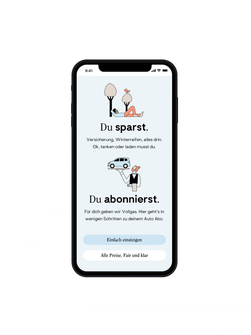
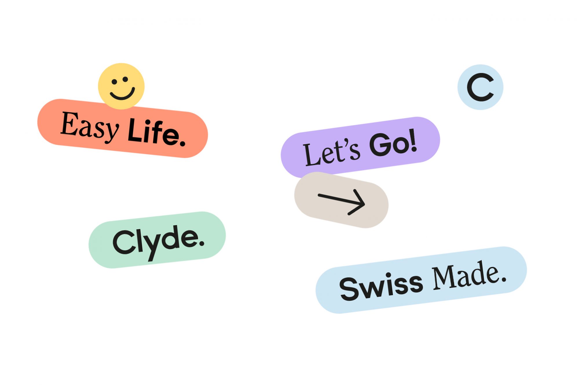
The heart of the design concept is the combination of clean and sophisticated typography paired with light and friendly colors. The charismatic serif typeface was chosen for its slightly condensed letterforms, as well as its rounded, playful serifs. It represents the more human, more joyful direction we wanted to take the brand. The serif is the customer, while the accompanying san-serif, with its simple forms, is the service – easy and direct. The modular compositional grid, seen across the brand design, is flexible, molding to the different format requirements, and appearing in the full range of brand colors. The design mirrors the service experience, in which the customer can pick and choose a car, subscription duration, as well as many add-ons to fully customize a package that is right for them.
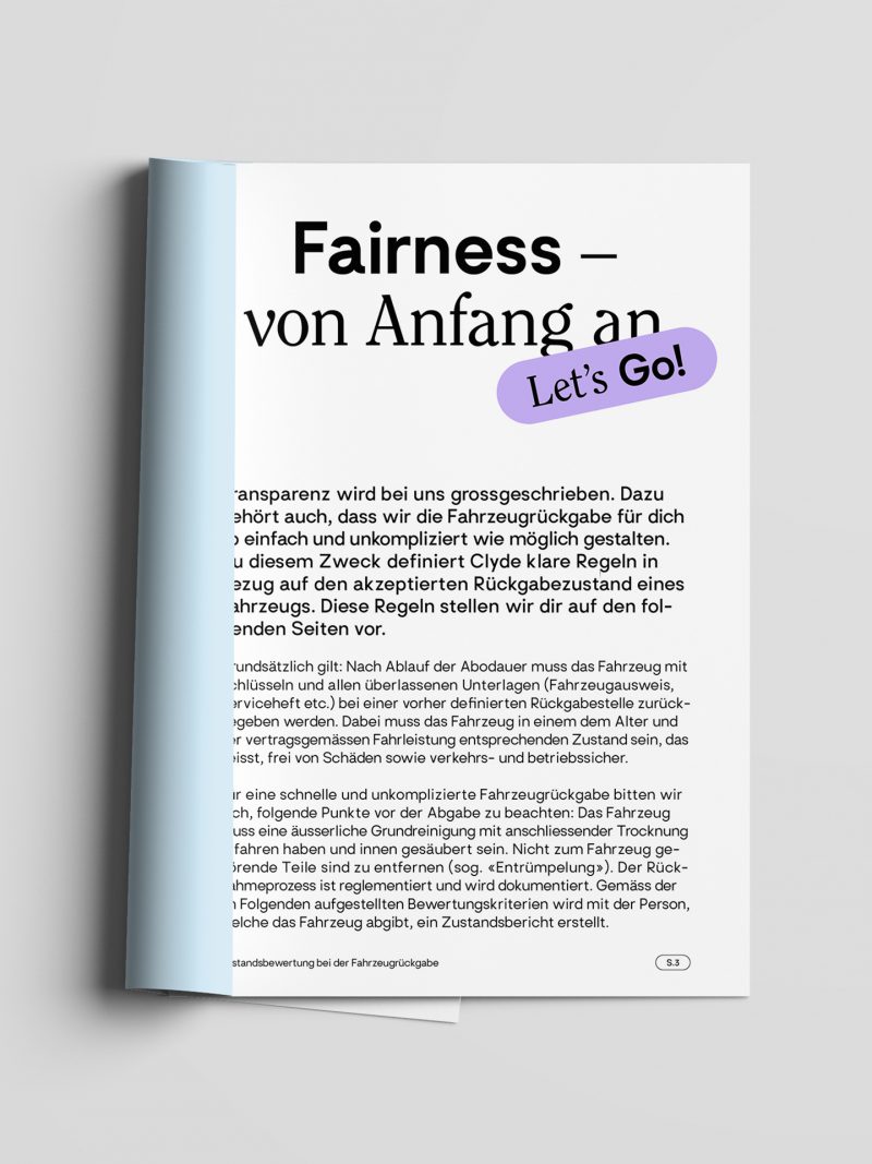
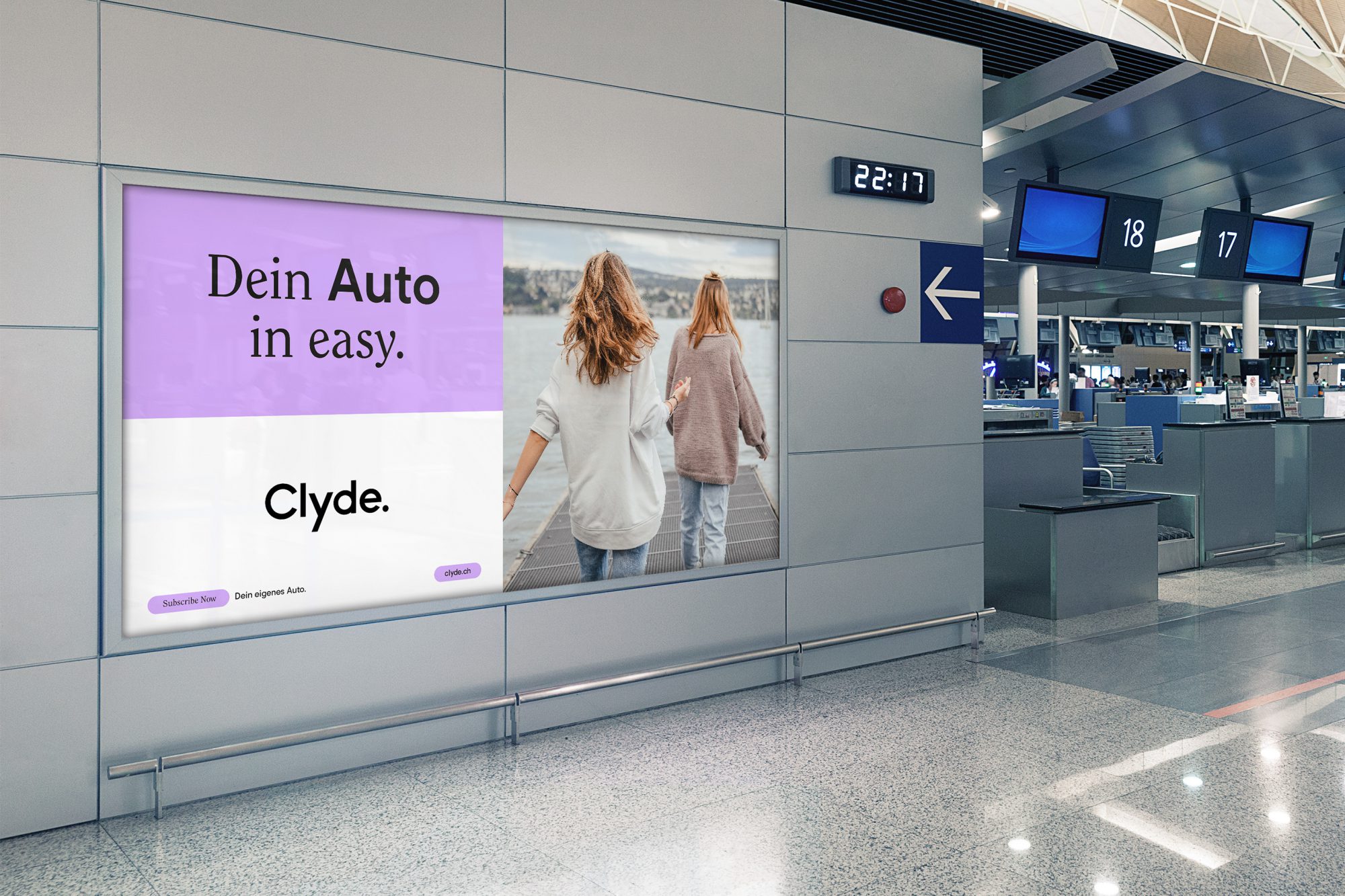
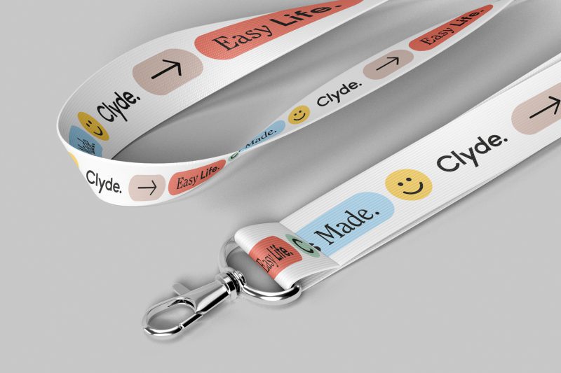
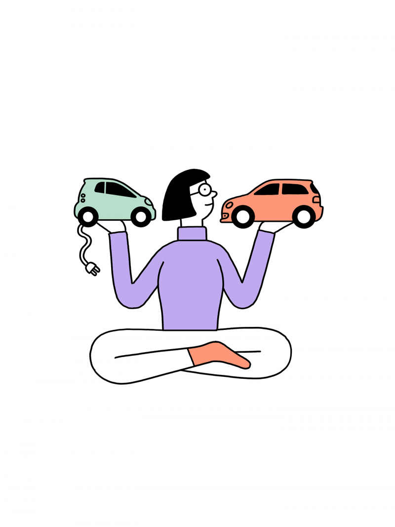
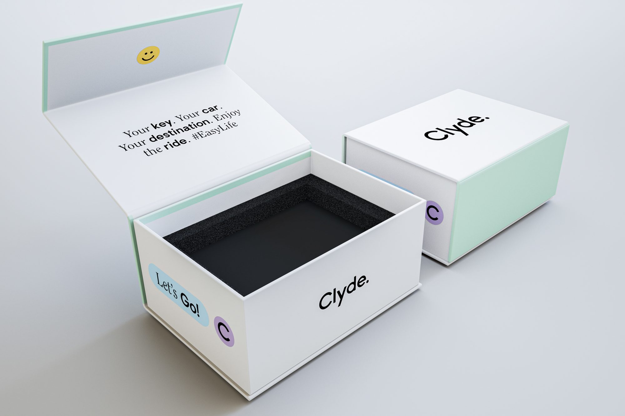
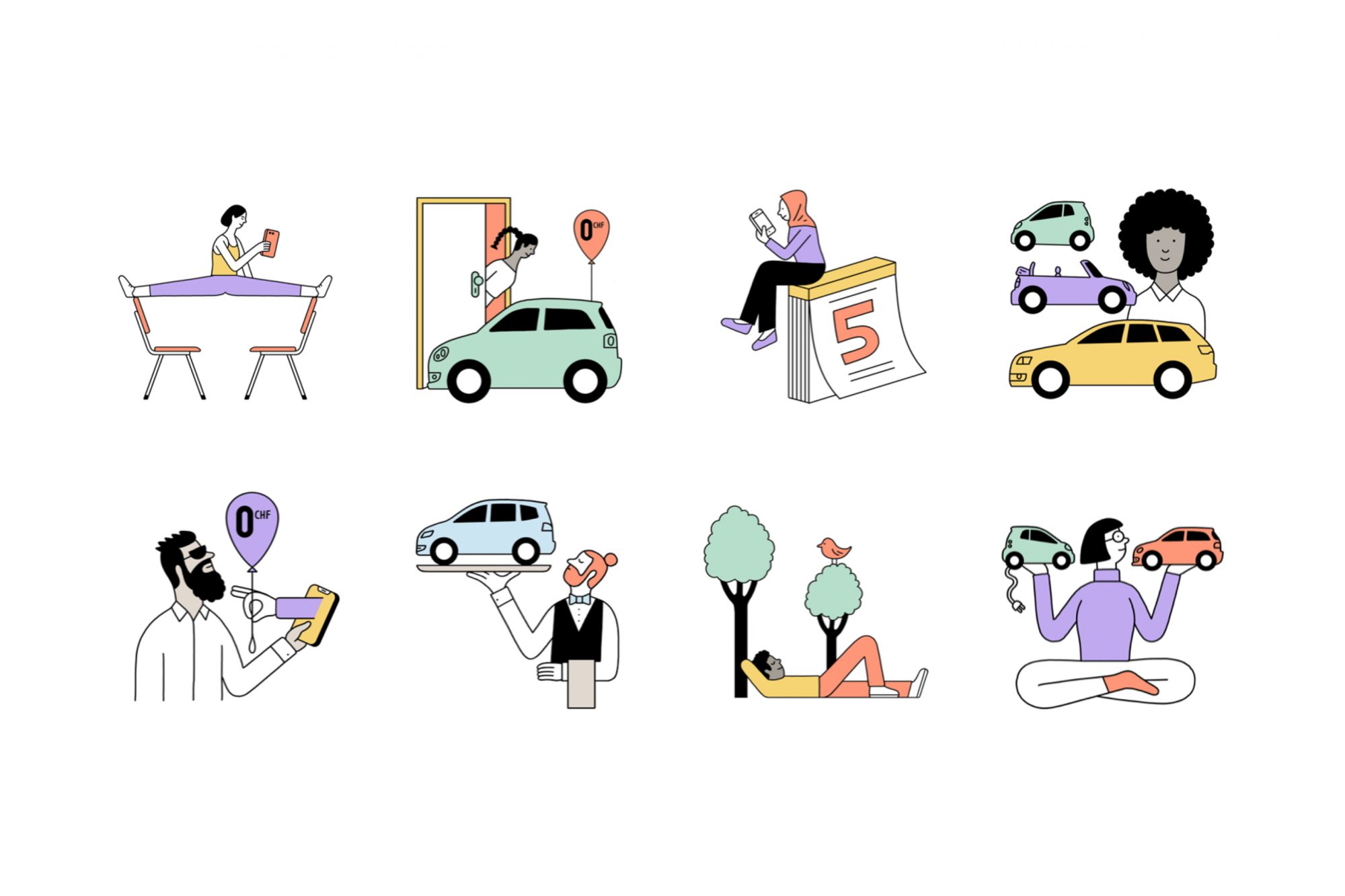
To ensure we delivered a full brand package, Cee Cee Creative also compiled a photography library to capture the brand’s spirit. Custom-made illustrations by Jochen Schievink and icons added to the overall easy vibe. The internal copywriting team developed the brand’s main claim – “Dein Auto in Easy!”, as well as other light-hearted brand slogans such as “Easy Life.” and “Let’s Go!” and copywriting for their website and collateral.
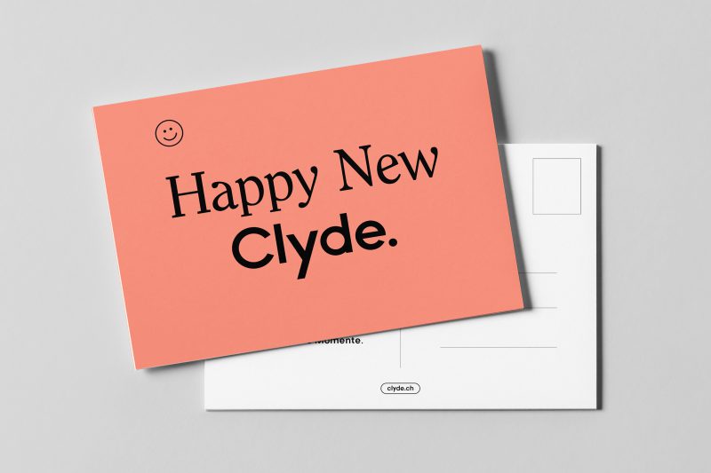
The new identity design was rolled out across multiple marketing materials from stickers and a customer welcome gift box to web banners and email newsletters. The website was developed by the agency, Wunderman Thompson, who brought our design to life online.
Facts
Client: Clyde
Industry: Lifestyle, Automotive
Services: Conception, design, copy writing
Location: Switzerland
Date: 2020-2021


Similar Work