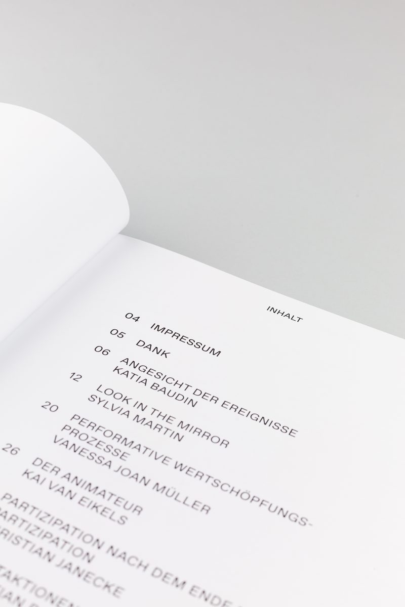
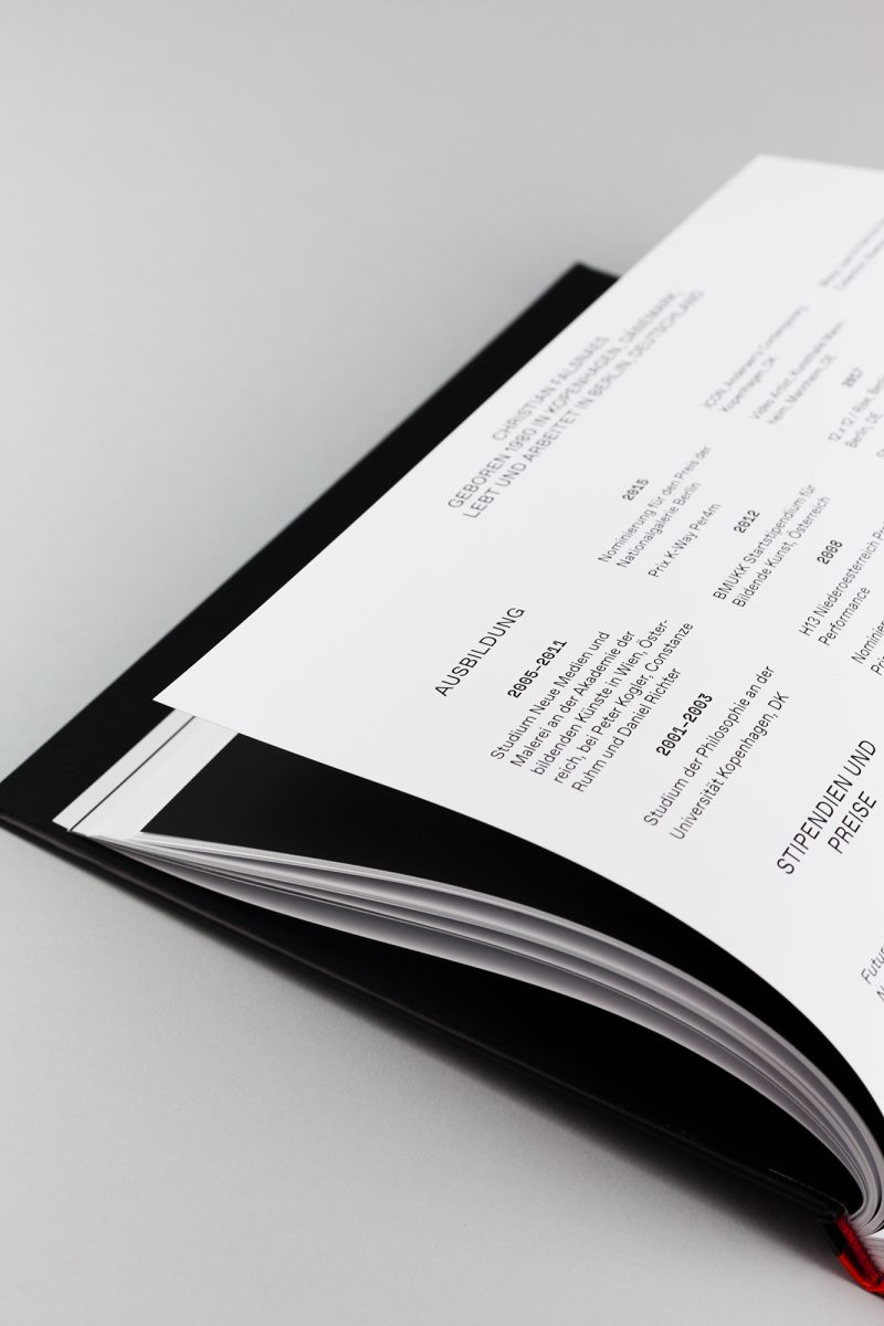
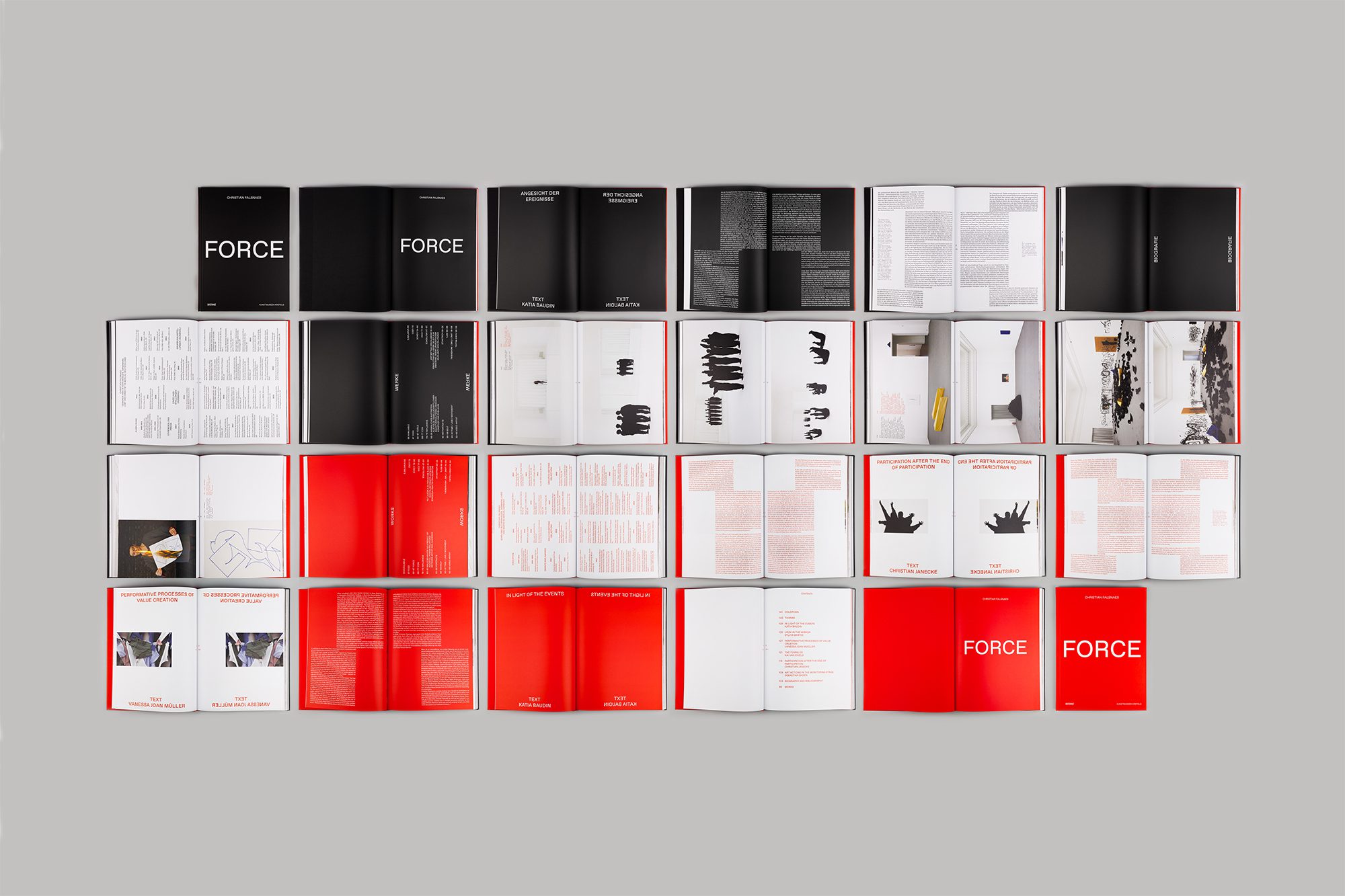
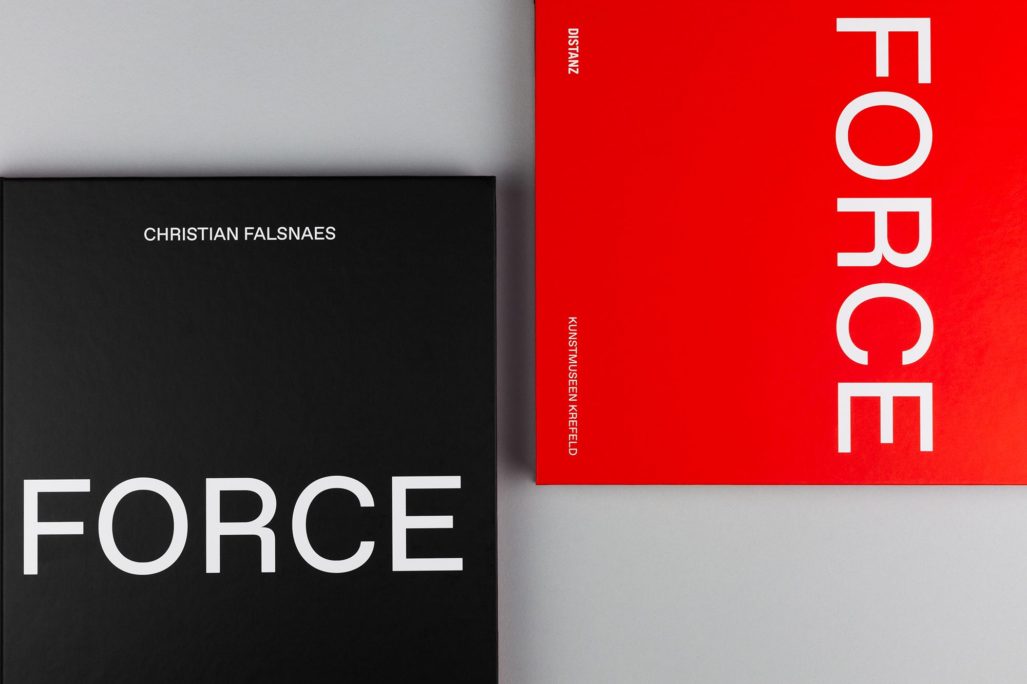
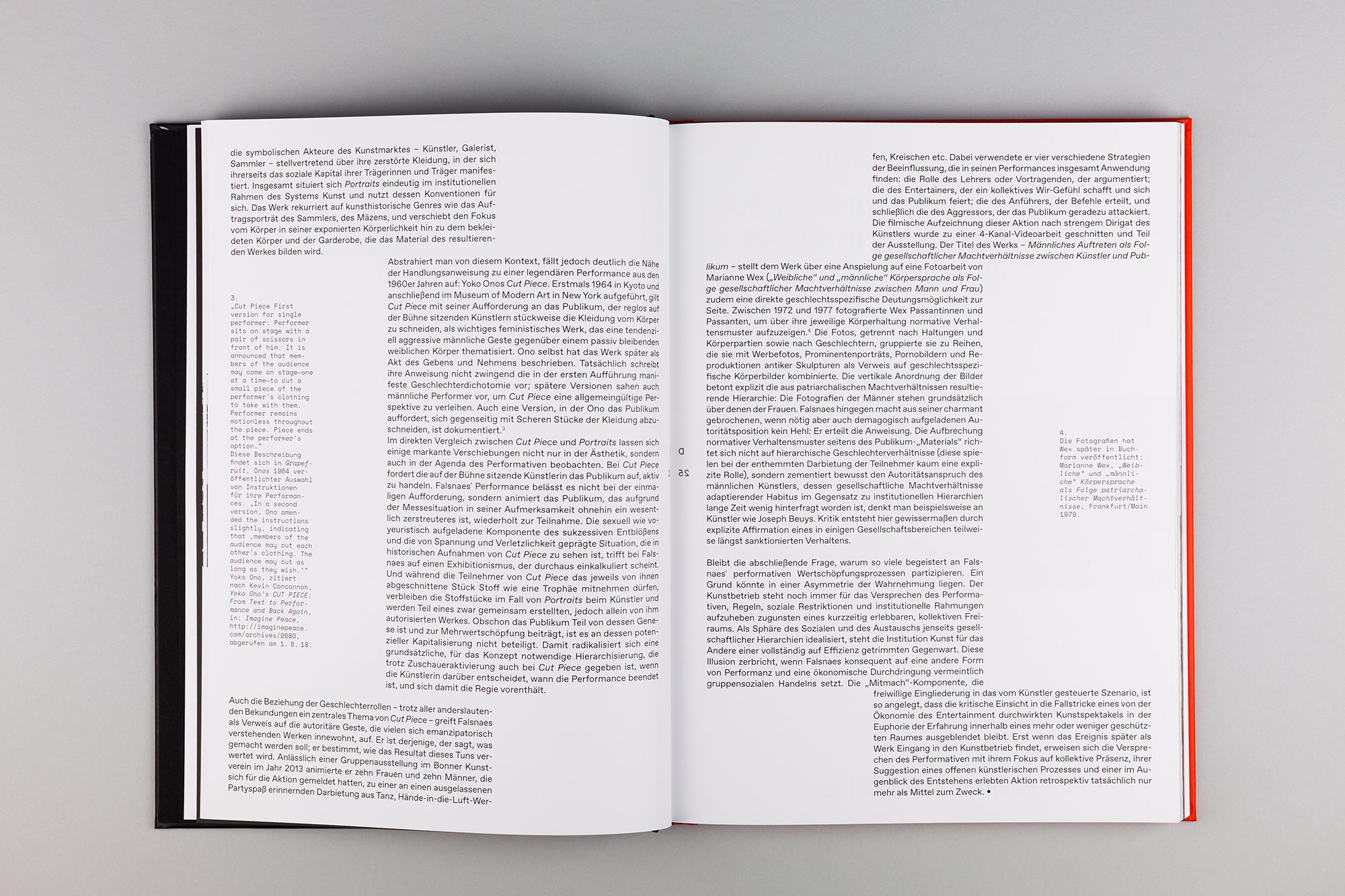
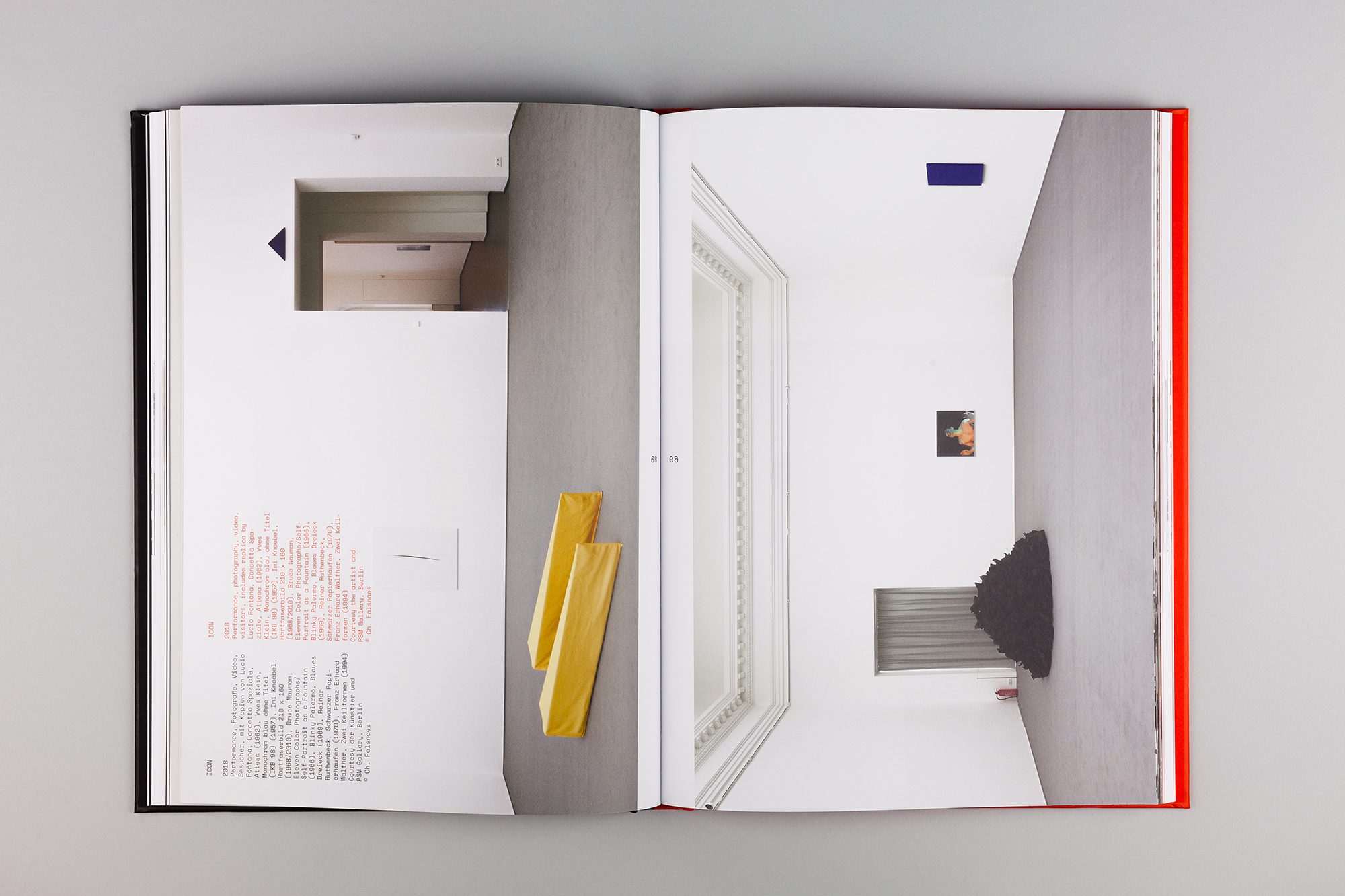
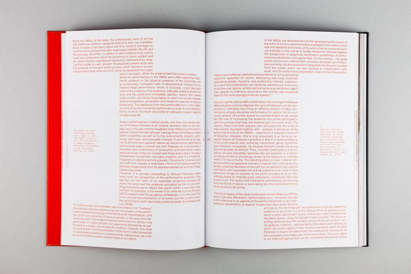
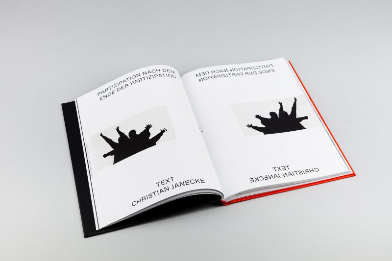
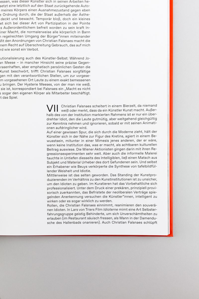
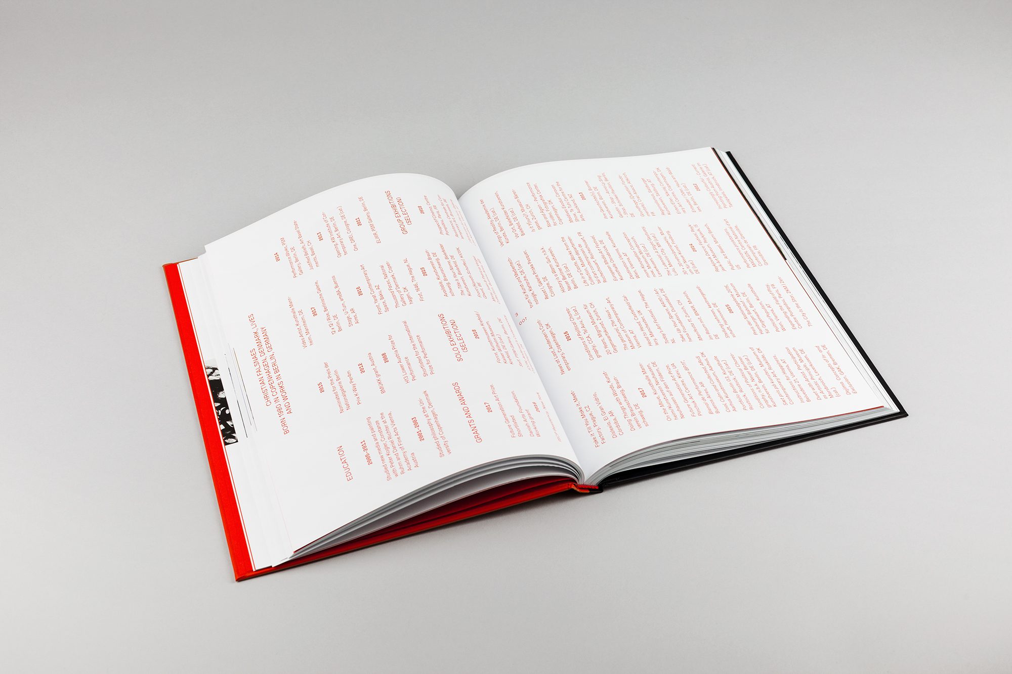
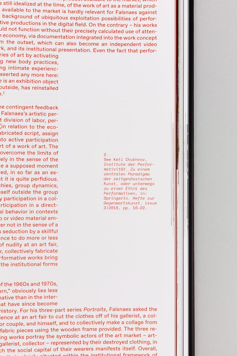
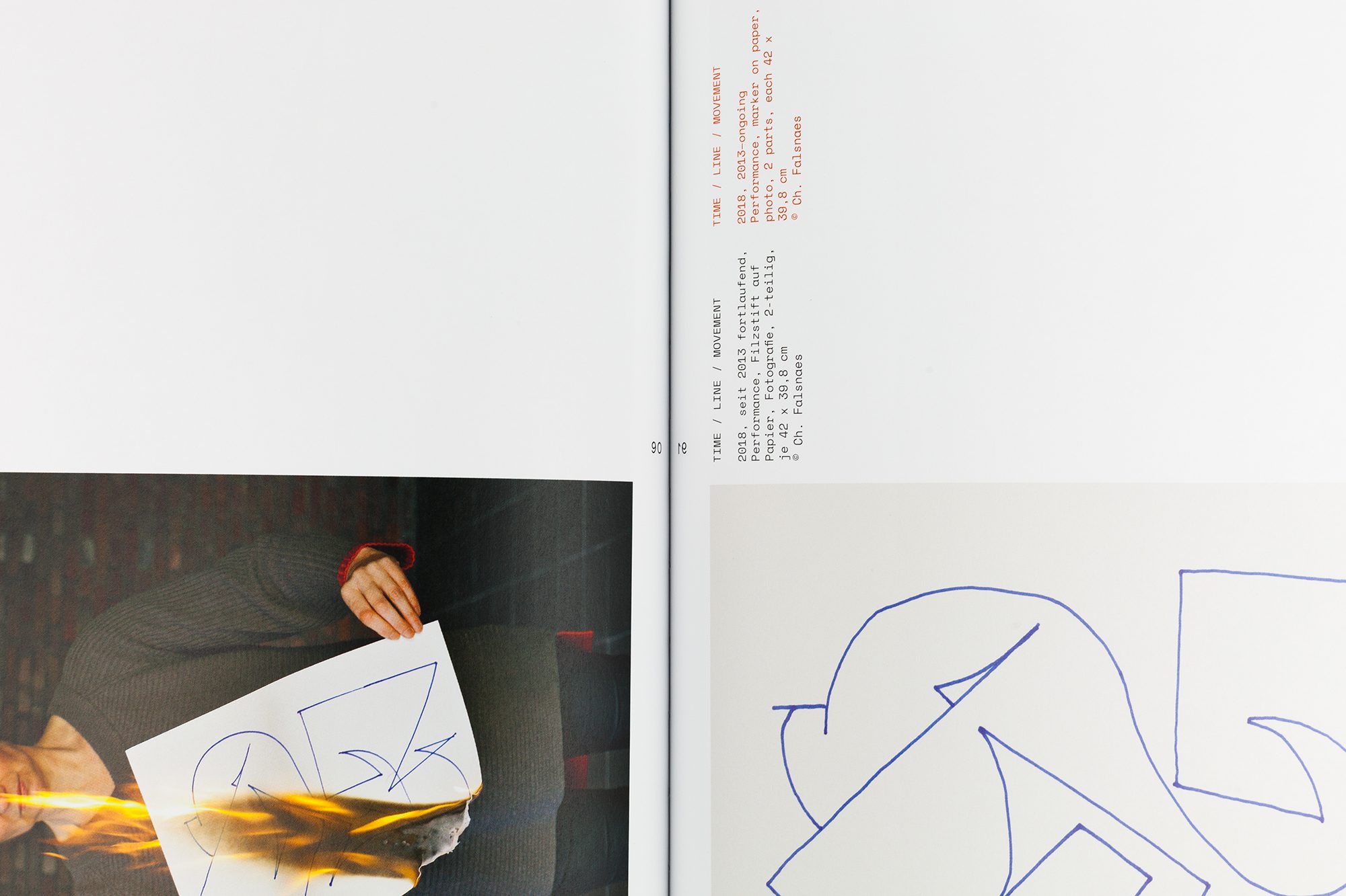
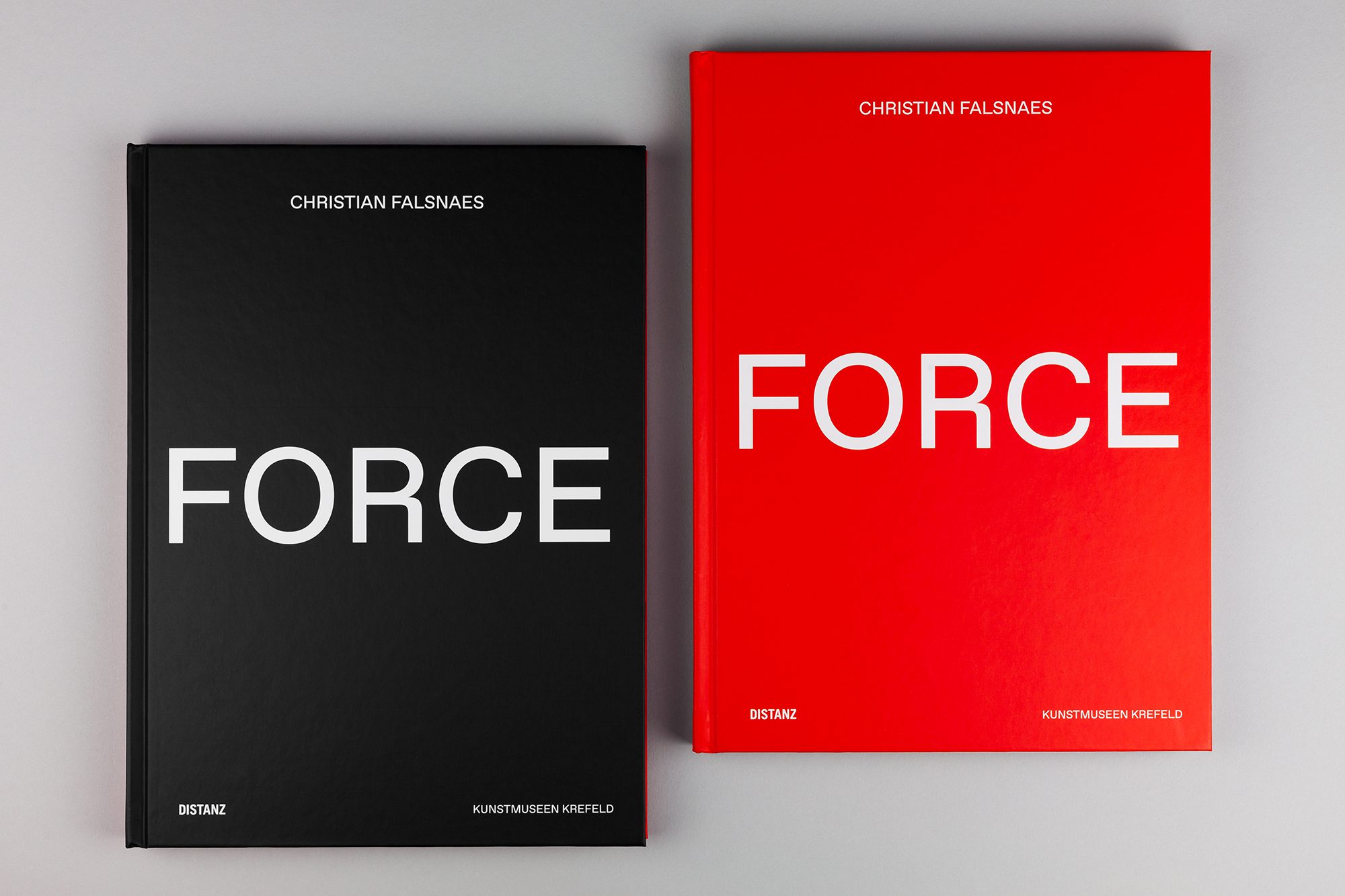
The task was presenting the exhibition of the artist Christian Falsnaes in a book. The Danish artist is known for strongly involving his audience in his performances, and often challenges them with confrontation. The title, Force, hints at central aspects of Falsnaes’s interactive art: power, authority, energy, and violence. This theme of confrontation is reflected in both concept and design to create a connection between the works of the artist and their documentation. The layout was mirrored across the page, but the content was inconsistently reflected to challenge the reader and create an irregular pattern as they explore the book. Through this method, the experiences of the exhibition were integrated into the volume and made perceptible. In keeping with the exhibition, the aim was also to design a book in which the reader would have to “work through” the content. The cover for Force is split into two colors, red and black, both strong hues, with a flip cover design differentiating German from English. The reader can begin from either side and progress towards the middle where the images are showcased. This representation avoids secondary treatment of a language, but nevertheless creates a contrast. This flip cover design allows both languages to be perceived as primary.
“Force” was honoured with the “Certificate of Typographic Excellence” from the Type Directors Club 2019.
Facts
Client: Kunstmuseen Krefeld, published in Distanz Verlag
Industry: Culture
Services: Conception, Layout, final artwork
Period: November 2018
Location: Krefeld


Similar Work